In 2025, 73% of web traffic comes from mobile devices – is your website ready? Aperture Canvas builds digital experiences that adapt seamlessly to every screen, from desktops to the latest smartphones.
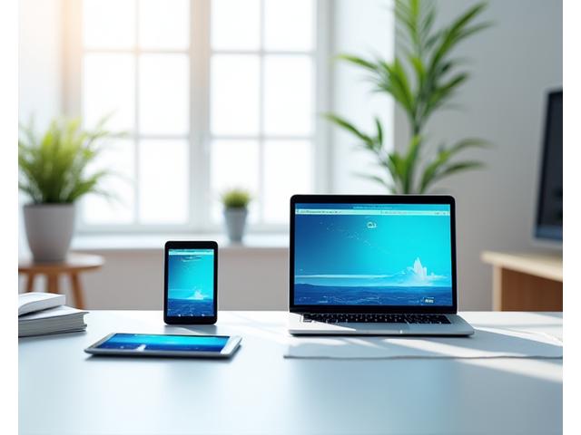
Speed and responsiveness are not just features, they're foundations for success. We optimize every aspect of your site for blazing fast performance.
Mobile Speed Score

Average Conversion Uplift

Target Load Time

We rigorously test your website across a comprehensive matrix of devices, browsers, and operating systems to guarantee universal compatibility and a perfect user journey.

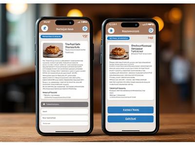
Pixel-perfect designs ensuring clarity and full functionality.
Intuitive touch interfaces optimized for larger touchscreens.
Lightning-fast load times and seamless navigation on the go.
Our commitment extends to cross-browser compatibility, ensuring your site works perfectly on Chrome, Firefox, Safari, Edge, and more.
We follow a proven strategy that integrates responsive principles from the very first sketch to final deployment, ensuring a superior product.
The digital landscape evolves rapidly. Aperture Canvas designs with tomorrow in mind, incorporating cutting-edge technologies to keep you ahead.
We prepare your site for new screen sizes and interaction methods, from foldable phones to smart displays. Your design will always feel native.
Unlock app-like experiences directly from the browser, offering offline access, push notifications, and fast loading even on slow networks.
Designing for voice search and ensuring WCAG 2.1 compliance means your site is accessible to everyone, expanding your reach and audience.
Our websites are built to leverage the speeds of 5G networks, providing ultra-responsive interactions and rich, dynamic content delivery.
Don't just take our word for it. See how our responsive web development has driven tangible results for San Francisco businesses.
 Aperture Canvas